

Virtual reality goes beyond the world of video games and 360 videos; it provides the opportunity to better communicate information to readers by having them experience data rather than just observe it. In instances where a bar chart just isn’t enough or when you find yourself making yet another line graph, this interactive website is here to guide you through the things to consider when creating data visualizations in virtual reality. It will tell you what works, what doesn’t, and some tips and tricks to make diving into data viz in VR that much easier.

Why virtual reality?
One problem that a 2D graph has might be its ambiguity in conveying information about volume. How many pizzas does America consume in a year? How much garbage does a person produce in a year on average? It is hard to tell when you look at bars on a bar chart. However, in a virtual reality environment you can see the pizzas stacked up together and the garbage piled up around you. When representing volume, virtual reality is able to give the audience a real sense of how large or how small the data is.
IN 2D:
IN VR:
Also, the immersive experience in a virtual reality environment can be more effective in evoking emotions of the audience. Imagine the astonishment walking across towers of pizzas piling up around you, or standing on top of a pizza tower and looking down to the ground. The emotions evoked by simply looking at the data representation may help the audience to stay with the data for a longer time.
Like other 3D environments, virtual reality adds a third dimension to the 2D surface, which makes it possible to convey multiple data layers in a single data visualization piece. Think about representing the comparison between different data sets and at the same time showing the change over time. It would not be as clear when such information is shown on a 2D graph, but it can be when depth is added to the representation in virtual reality.
IN 2D:
IN VR:
In 2D graphs, the best way to show change over time is probably a line graph, but with one more dimension in virtual reality, a lot more options are provided to show change over time more effectively. Change of environment, animation of a heat map etc. can provide the audience with more direct impression of how the the data changes over a certain time period.
A 2D data visualization is usually stuck in the one perspective that its author creates it in. It is also always viewed from a 3rd person perspective, as the viewer is a detached observer of the visualization on their screen. In VR, there is the incredible potential to switch between perspectives. When the viewer is viewing the data from a detached perspective, they can take in all of the information at once, and usually with a fair amount of accuracy. When the viewer is in the 1st person, they're surrounded by the data, allowing them to interpret it in a new and immersive way. This is the potential of embodied cognition that is only possible in VR: changing the viewer's environment can change their thinking about the data. With the ability to switch automatically or by user input, the viewer can gain both a precise and immersive perspective with a single VR experience.
IN 2D:
IN VR:
Scale is also an important and unique aspect of perspective in VR. If everything is at a 1:1 scale, then the viewer can see data represented as it would look in real life. This could have a profound impact, such as looking at a stack of money that is taller than the viewer. There is also the potential to manipulate scale in real time. The viewer can get a general overview of data if they zoom out all the way, but as they zoom in, they can find themselves more immersed, while also looking at more detailed levels of data. This is similar to how you can find more detailed information as you zoom in on a 2D map, only VR allows this in 3D.
While a single representation of data provides the audience with the creator’s perspective, VR makes meaningful interaction between the audience and the visualized data possible. The audience will not only be able to see the data, but also explore different aspects of the data with their hand control, teleportation and 360-degree views within the virtual environment. The ability to manipulate the data representation creates a true exploration potential for the audience.
IN 2D:

IN VR:
Another incentive brought by the interaction in the virtual reality environment is how it brings out different levels of details by simply zooming in and out of the data representation. An example of this could be the Google Earth where users are able to zoom in at any place on the user interface (the globe in this case) to see the names of the streets. It gives the audience freedom as to whether they want to see the story's whole picture or just the most detailed information.
experience types
Deciding on whether a VR data visualization should be passive or active is largely a function of what type of VR device the experience is viewed on. Passive experiences, where the user does not interact with or manipulate the visualization, are best for headsets that lack input controls, such as Google Cardboard.
PASSIVE:
ACTIVE:
Active experiences, where the user is engaged with interactive elements, are best for high end VR experiences that have input controls and positional tracking. Positional tracking, where the user can move with six degrees of freedom (DOF), is traditionally accomplished with external tracking components, such as Lighthouse base stations for the HTC Vive, or tracking sensors for the Oculus Rift. This allows the user to move around the space. There are also headsets without positional tracking (only three DOF), such as Google Daydream, that still have input controllers. These can still be used for active visualizations, because the controller can act as a laser pointer, for example.
Since VR has such a large potential for perspective, it’s important to consider from the beginning whether a visualization will be 1st person, 3rd person, or both. Traditional 2D visualizations can all be thought of as 3rd person; you’re viewing some sort of chart type from an outsider’s perspective, simply looking at it on your screen.
In VR, just like in any videogame or narrative, you can characterize a visualization from a similar 3rd person point of view. This could mean placing the user in an environment where the visualizations are like small models on a table, or paintings hanging on a wall. This is useful for easily seeing all of the data at once, but it doesn’t do much to take advantage of the unique perspective VR can offer.
3rd PERSON:
1st PERSON:
This is the allure of 1st person VR data visualizations: immersing the user in an environment that is formed out of the data. For example, in the 1st person, scale in proportion to the user’s height can be used to give a unique metric for the data. Overall, the immersion of 1st person data can leave a lasting impression on the user, but it also can give a misleading characterization of the data.
3rd person and 1st person VR data visualizations both have pros and cons, so combining the two may be the most ideal solution. Either through user manipulation or automatic resizing, the visualization can switch, for example, from a chart on a table in front of the user, to a chart that surrounds the user like skyscrapers on a city street. The user can benefit from the unique immersion of VR, while also getting an impartial perspective that allows for the most accurate reading of the data.
It is also important to consider if the visualization will stand on its own, or exist integrated into a larger story. An integrated VR data visualization, such as a WebVR component on a text-based story, has a lot less work to do. For example, it could offer only a 1st person perspective, because the most accurate 3rd person perspective can come from a traditional 2D visualization that’s also integrated into the story. If the data benefits uniquely from the 3D perspective of VR, then it can exist in the web story as a complete replacement for a 2D visualization.
STANDALONE:
INTEGRATED:
What’s even more exciting is thinking about a VR data visualization as a standalone experience. This would mean the entire narrative is told within the visualization. There is a lot to keep in mind with standalone experiences: the narrative, getting across an accurate representation of the data, and offering all the necessary explanation in VR. This is hard, but it also has the most potential for any type of VR data visualization. It would definitely benefit from interactive components and positional tracking, but it could also exist as a standalone visualization even on a device like Google Cardboard. What matters most in a standalone experience is the depth of immersion; it must be compelling enough to exist on its own.
There are many characteristics of VR that lend itself more to data abstraction than literal, numerical data representation. VR displays are behind traditional displays in sharpness, it has a fairly steep learning curve for the majority of people, and one of the main benefits of VR is its emotional potential. For VR data visualizations with a strong narrative, abstraction seems to be a necessary component, because the focus is more on storytelling and emotional response rather than a precise display of data.
ACCURATE:
ABSTRACT:
However, VR is also a unique way to view some forms of data more accurately than is possible in 2D. For example, 3D line graphs are not elegant in 2D, but they are easily understandable in a 3D environment. Rather than rendering a 3D visualization on a 2D screen, it is more intuitive to view a 3D visualization in the 3D environment of VR. In cases like these, literal data representation is the goal.
Effectively using text is hard in VR, because it’s simply hard to read, but also because it’s hard to ensure the user reads the text you put in the environment. Data visualizations need some amount of text to properly quantify data, but it’s difficult to do this effectively in VR. Using text to make a visualization clear is one of the hardest things to do to make a VR visualization more precise, which is another reason why VR often lends itself to less precise numerical representation and more abstraction.
narrative
When it comes to presenting data and storytelling in an immersive 3D environment, it is important to keep a few things in mind: First, you do not want to simply take a 2D chart, stick it in VR, and hope that it somehow conveys the information better than before (it probably doesn’t). It is important to think natively in VR and come up with ideas about how to represent data in different and more immersive ways. Say you are looking at a chart that tells you how much pizza Americans eat in a year (compared to other comfort foods). Instead of simply making a 3D bar chart with the same information, you could surround the user with piles and piles of pizza, and have them navigate a world covered in mountains of pizza.
Emergent storytelling: don't force the viewers into a story; let them discover one for themselves
As a visualization becomes more and more metaphorical, it may begin to look less and less like a “traditional” chart type and that’s okay! A VR experience should not force the user into the story; it is important that they discover and follow the narrative for themselves. We can offer up helpful guidelines here and there to assist the user (by manipulating the focus of attention, and using visual/auditory cues and so on) but ultimately, they should have the autonomy to be in control of their own experience. This is the difference between the predominantly author-driven narratives of 2D visualizations, and the reader-driven narratives that we recommend for VR visualizations.
User interface
- Eye level and downward is the most comfortable place to view content. Try to avoid having the user look up too much in your visualization.
- Balance the amount of text to make the visualization clear and useful. Text is hard to read in VR, and it's difficult to find an optimal place to put it. Therefore, try to make the visualization speak for itself as much as possible. Text that provides a key or numeric value, for example, does not always have to be visible, and maybe only pops up when looked at directly.
- Reduce the field of view to reduce nausea during movement. This is employed in Google Earth VR, and is a useful tactic for continuous movement where teleportation is not possible, such as a VR rollercoaster.
- Consider how different people will experience virtual reality differently: background, prior experience, and height can all play a factor. VR is still new for a lot of people; try to reduce the learning curve of using your VR experience as much as possible.

This diagram by @beaucronin shows different potential environment types for VR data visualization. Shell and landscape types are equivalent to 1st person experiences, while the others can be considered 3rd person.
our approach
Before you start creating your data visualization, be sure to note a few things—working in 3D has its perks, but it is important to think outside the box and ask yourself: What can VR offer that 2D cannot? Once you can answer that question, you are ready to get started.
Below you will find four different chart types and suggestions on how to translate them into VR. For each chart type, you'll find a list of advantages and disadvantages for making a VR data visualization. You'll also find several visual aids. Some of these come from external sources, while others are rudimentary, non-functional prototypes that we made to express our ideas, mostly using the VR painting app Tilt Brush, and the 3D voxel painter MagicaVoxel. We have links to all the tools we've used in the Resources section. While our prototypes are based on real data sets, most of them don't reflect the actual data, so keep that in mind when viewing them.
Since this is a website all about VR, we thought it would only be appropriate to have some interactive VR components. Using Sketchfab, our prototypes can be viewed in 3D or VR. To view them in 3D, simply press the 'Play' button and they'll load right on the page. You can move around with your mouse to see all the perspectives someone would have in VR. If you have a Google Carboard or similar mobile VR headset available, you can also view these prototypes in VR. Once you tap the 'Play' button and the model loads, tap the Carboard icon in the bottom right of the screen. This will take you into VR view, letting you experience our prototypes in their full, VR glory.

When thinking about data visualization in VR, working in the native space of VR with our prototypes felt like the best way to try and understand the challenge. We hope you enjoy the glimpse at our process that our prototypes offer, as well as the information we've gathered on each chart type. None of us are artists, so our prototypes are not the best, but we think they offer a valuable insight into the massive potential of data viz in VR.
heat maps
General Thoughts on Heat Maps
Virtual Reality offers a number of different ways to interact with heat maps that are not possible with 2D visualizations. With data viz in VR a user can…
- Walk across the map
- Experience elevation changes based on the data
- Get an aerial view
- Zoom in and out to see a heightened level of detail
Prototypes
VR gives us the ability to convey information in ways other than color. The following prototypes are examples of this.
Using Depth
This heat map shows proportion of the population with health insurance, using depth in addition to color to show where the highest proportions of the uninsured live. In VR, depth has more impact because of its ability to pop out at the user.
Using Objects
When we want to use a 2D heat map to represent the traffic information in a certain area, say, the state of Illinois, we normally use colors to represent the traffic density. But what color represents a traffic jam? How severe is it on a ‘red’ road? It’s hard to tell from just the color representation on the map.
In this VR heat map, we represent the traffic information using objects from an actual scene. Users can switch among the scenes from the buttons on the left side. The objects we choose are cars, people (imagine that these people are all riding a bike), and a bus.
The density of the traffic can be directly seen and compared from the heat map scene. For example, when the street is filled with cars, the traffic looks really bad. When you change the cars to a bus or people standing on the street, the street looks much less congested. But actually, in all three scenes there is the same number of people in this area. Another incentive for using an actual scene is that you can convey additional information from the heat map. In this prototype, we would have actual traffic noise from each of the scenes, further immsering the viewer.
Using a 3D Projection
VR also allows us to make comparisons on a 3D projection, once again using depth instead of color.
This is a prototype showing the pollution output of 6 countries. Since the heat map is on a global scale, it made sense to preserve the 3D globe for viewing in VR. Instead of using color, bar chart-like columns are used, providing a metaphor for plumes of smoke and pollution. From a 3rd person perspective, it's easy to manipulate the globe to view each country. However, it is difficult to make comparisons between each country like this, so there is a duplicate of all the columns on an even plane to the right of the globe, allowing for easy comparison.
One can also easily imagine zooming in on this globe in VR. As you zoom in, you begin to see more detail for each country. Instead of just one large plume of pollution, you can see the most polluting areas of the country, and as you continue to zoom, you begin to see the outputs of individual cities, and even individual buildings at the smallest level of detail.
Final Thoughts on Heat Maps
Working in VR has another benefit for heat maps; it allows us to combat distortion of both geography and data. While in 2D, data distortion is combatted by using area instead of color to represent data (known as a cartogram), in VR, 3D already gives an accurate representation of area, and we can use volume to combat data distortion. We can have accurate geography and data in VR, unlike in 2D, where you have to pick one (heat map vs cartogram).
For example, when showing the electoral college, 2D data visualizations have to choose between accurately representing the size of the state, or proportionally representing the state's number of electoral votes, such as with a cartogram. In VR, we could represent the size of US states accurately, while also using depth to show the number of their electoral votes. This is the benefit of dimensionality; representing several layers of data.
bar charts
General Thoughts on Bar Charts
Bar charts are pretty boring in 2D, but the power of VR can do a lot to make them more interesting and impactful. Here are our main pieces of advice for using bar charts in VR:
- Keep in mind that looking up and down is sometimes more difficult than looking left to right—consider making bar charts that go left to right in a frame that could be as simple as an x- and y-axis in front of the user.
- Scale is very important for VR bar charts. You should have consistency in scale when creating several VR data visualization experiences in a series.
- The skyscraper metaphor: it is tempting to scale bar charts to be massive in VR, so the user looks up at them like skyscrapers. However, for the user, meaning gets lost at a certain point because all the columns just look really tall when you are looking up, so there's no other useful comparison. Looking down may offer a more useful (and comfortable experience). You could also just simply use a smaller scale, or give the user the ability to zoom in and out and navigate around the bars.
- With positional tracking in VR, you can't properly read the axes to get the exact height of the bar chart, unless you have a grid overlaid on top.
- Presenting a bar chart in VR provides the opportunity to give the user different vantage points: Top, Bottom, Front, Back. This makes it possible to layer data, or give a new perspective to dynamic data.
- Think outside the box! Abstraction is good here. You can replace the bar with something representative of the data. Think about piles of pizza, a bar stretching to the moon and back, and a pile of burning coal. However, also keep in mind there's a tradeoff between accurately representing data and representing it in a more expressive way. If you heavily abstract the data, you should also offer a traditional bar chart that the user can toggle on and off.
Prototypes
Left to Right and Changing Vantage Points
In this bar chart prototype we use a race metaphor to represent the economic growth in some of the major countries in the word. Instead of using vertical columns, we use left-to-right bars for people to easily make comparisons. The dinosaurs running in front of each country is a representation of the race subjects. If the users want to see which country has the greatest economic growth, they can compare the position of the dinosaurs. If the users want to see which country grows the fastest in each year, they can hit the year button and see the dinosaurs running past them at a speed of their own. You can rotate the perspective 90 degrees to see the dinosaurs racing toward you. This is also the default view in VR, which offers an exciting and unique perspective that enhances the race metaphor.
The Skyscraper Metaphor
These three Sketchfab models are all the same prototype from different perspectives. As we discussed above, the difficulty with the skyscraper metaphor is the loss of accuracy when looking from a 1st person perspective. This can be seen in the first view, where you're standing on the ground and looking up at the bars as if you were on a street looking up at skyscrapers. The inspiration is the annual revenue of Netflix and Hulu (but the data in this prototype is not accurate). While there is certainly an impact in seeing just how large the bars are, it's difficult to see the significance of individual differences among the years.
A potential improvement is the perspective from the top of the highest bar. Here, it is easier to see the size difference between the top bars, but the problem still persists for the lowest bars. Once again, there is still a unique impact of looking at the bars as if you're in an observatory at the top of a skyscraper. This could be improved further by representing the bars as skyscrapers themselves, or representing them as stacks of money and using real buildings next to them for comparison.
The solution to these skewed perspectives is offering the 3rd person perspective within the same experience. Here, there is still a benefit to VR because the viewer can move to see the rear layers of bars that would be hidden behind the front layer in 2D. This prototype also shows the potential of viewing multiple visualizations side-by-side in VR. They appear in 3D frames that could potentially be moved around and layered on top of each other for even more comparisons. However, with positional tracking, the y-axis lines don't offer an accurate reading of the y-value of the bars. This can be alleviated by adding a grid on top of the chart.
Abstraction
This prototype places the user among piles and piles of pizzas (the amount of pizza Americans consume in a given year) with the goal of more clearly conveying just how much pizza is consumed. The user would be encouraged to roam around and navigate the world of pizzas.
Similarly to the pizza prototype, this 3D bar chart illustrates the most commonly consumed comfort foods across the U.S., but instead of using classic bars, we used the actual food. The idea is that the user could walk among the piles of food and also zoom in and out to gauge their relation to one another. The massive quantities are expressed by the piles of food towering over the viewer.
Final Thoughts on Bar Charts

Bar charts show a lot of potential in VR—especially when you deviate far from a traditional bar. Above is an example of what using life-size money stacks would look like in VR in LookVR, one of the few existing tools for data visualization in VR.

One of our favorite examples of thinking outside the box with data visualization in VR also comes from LookVR. Here, they scale up the bars immensely, and turn it into a rock climbing wall. Having the user spend time and effort scaling the bar is an incredibly novel and impactful way for them to appreciate just how high the bar is.
line graphs
General Thoughts on Line Graphs
The passing of time can be very interesting in VR. The best way to represent time depends on context; here are a few possibilities to consider:
- Changing environment (showing the user time passing literally, such as with the sun rising and setting, or the Earth rotating around the Sun)
- Clock, calendar, watch (or any other physical representation)
- Keep in mind that each of these approaches still needs to be coupled with some sort of tracking along the line graph to help the user understand the data.
In VR, it can be very interesting to watch the line chart grow, pulsate, etc. VR also allows us to combine different data sets along the same time axis. In addition to the line graph changing along the time axis, viewers can watch concurrent data pop in and out in the environment:
- Concurrent Twitter stream, photos, videos, 360 photo/video spheres, and sound are all possible additions
- For the viewer, granular user control is important when combining data sets, so they can go back and see the relationships better at any point along the time axis
Prototypes
Concurrent Data Layers
In this line chart, the number of tweets containing certain location names is charted over the course of four days in 2011, when riots broke out around England. Ideally, this would be a dynamic visualization in which the lines would form as time passed, with additional information such as photos or video appearing as the viewer moved through the timeline.
Immersion
This prototype, also shown at the top of the website, shows the impact of fully immersing the viewer into a data-driven environment. The line graph traces the ozone concentration over Antarctica from 1980 to 2013. At the same time, a heat map that fills the sky and surrounds the user shows the decreasing ozone concentration in the atmosphere. The ozone hole is represented as a literal hole, with space peeking through. Another concurrent data layer is the ocean that surrounds the viewer. In 1980, the user is standing on a large glacier, but as the years go by, the ice begins to melt, and by 2013, the viewer is left on a small floe of ice.
This prototype shows the technique we described above of aligning several data sets along the same time axis: ozone concentration, ozone hole size, and Antarctic glacier size. In this immersive environment, it makes the correlation between the data sets incredibly clear, and provides an emotional impact that non-immersive visualizations cannot rival. Ideally, when the viewer enters this experience, it progresses automatically throughout the years, with the option for the viewer to go between the years manually at the end and look at more detailed numbers.
Note for the astute: There is a polar bear in the visualization, even though polar bears are nowhere to be found in Antarctica. Once again, these prototypes are only loosely based on real data sets...
Sound

This prototype was made in Unity with the SteamVR plugin. It is viewable in VR with the HTC Vive, but there was no easy way to port it to WebVR for viewing on the website. We've included it because it uses a powerful aspect of VR that we haven't covered much yet: sound. The positional, immersive audio that is available in VR can have a deep impact on a user. Here, two line graphs chart the fall of Islamic references and rise of Christian references in rap music. As the time progresses, audio clips of the songs play, giving the user an auditory way to experience the data.

The user also has the ability to travel among the line graphs as the time progresses. In this intimate 1st person view, the audio clips surround and immerse the user, with each line graph playing audio in different ears. This provides a unique way for the user to perceive the change in religious references in rap music.
Final Thoughts on Line Graphs

One of the first data visualizations in VR was featured on the Wall Street Journal, depicting a rideable line graph rollercoaster that follows the stock market and tech bubble. This is a really fun way to make a line graph interactive, givings the rises and falls of the graph new meaning.
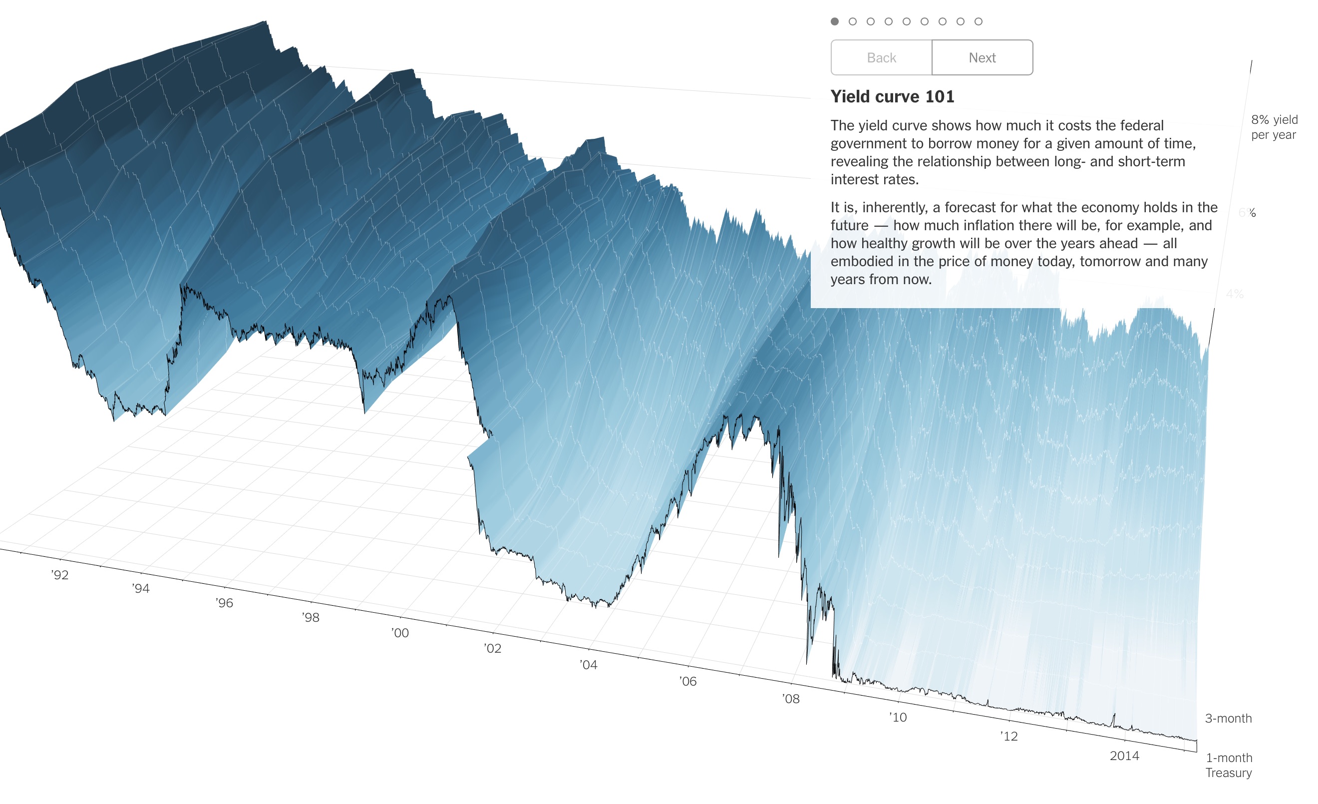
While not a VR data visualization, this 3D yield curve line graph in the New York Times would go perfectly in a VR environment. This is another demonstration of how VR can sometimes lend itself to data visualizations that are more accurate and precise than 2D versions.
pie charts
General Thoughts on Pie Charts
With VR, we are able to combine multiple data sets in specific ways, such as with:
- Income distribution
- Population and land
Applied to pie charts, this broadly means dividing up a single volume into parts. When we explored this type, we quickly realized the pie shape is as limiting in VR as it is in 2D. Therefore, we explored other, more interesting ways to represent the information to the user:
- Using liquids to fill a container
- Creating a stacked bar chart
- Using a shape that isn't a pie
- Making something that can be destroyed and put back together
Prototypes
Multiple Data Sets
In this pie chart prototype we want to show a relationship between two different data sets. Recall that a pie chart is powerful in representing a part-to-whole relationship. We use the pie chart to represent land areas. Instead of having two pie charts and a description, we used the third dimension in VR to put the actual population on the pie chart. The users can easily tell from the prototype that 90 percent of the population is living on less than 20 percent of the land.
Narrative
Even though pie charts are a somewhat infamous form of data visualization, they still have a novel potential for narrative in VR, especially if the topic is dessert pies! Here, the viewer stands at a table, almost as if it is Thanksgiving day. They can look down and admire a complete pie, filled with all the most popular forms of pie served on Thanksgiving. They can also look at the exploded view of the full pie, with a plate dedicated to each pie type. A pie chart made out of dessert pies is incredibly fun in real life, even if it isn't used to represent data about dessert pies; VR allows us to recreate that fun without the need for baking.
Volume
While 3D pie charts are infamous in 2D for giving an inaccurate representation of the data, this problem can be avoided in VR. Since the user can manipulate this prototype as they see fit, they can see the entirety of the data, as opposed to 2D visualizations where the frontmost portion of the chart always obscures the rear portion. Here, we're also using a cube shape, because we think the definition of a pie chart in VR can be expanded beyond the literal pie shape. It is still incredibly quick and easy to gauge data from this visualization, especially by emphasizing a certain chunk of the cube with the glowing effect. Adjusting the brightness of certain parts of the image is very powerful in VR as a means of attracting attention.
Final Thoughts on Pie Charts
Just like in 2D, VR pie charts have very limited uses, mainly in drawing part-to-whole comparisons of just a few things at once. We also noticed that pie charts are mainly only useful in the 3rd person in VR. A 1st person version, where the user stands on a pie chart, doesn't work because the user can't see the whole pie chart at once, defeating the purpose of a part-to-whole comparison.
conclusion
Through our research and prototype-based exploration of VR data visualizations, we have found many ways in which virtual reality provides a unique and valuable aspect to data visualization. To reiterate, these are some of the main instances where VR is an ideal way to visualize data:
- There is something to manipulate
- Visualizing volume is useful
- The data is represented along 3 axes
- You want to see context surrounding the data
- There are multiple data layers
- You want the ability to zoom in and out to change the level of detail
- You want to show change over time
- You want to evoke emotion through an immersive experience
- You have a narrative that could benefit from VR

We'd also like to add that our findings are nowhere near exhaustive. For example, there are several other chart types that have a ton of potential in VR. The screenshot above shows a VR scatterplot from LookVR. 3D scatterplots are another chart type that benefit from the unique environment of VR.
Also, we want to emphasize that when testing a VR data viz, user testing is an imperative part of the process. VR is a new and unestablished frontier. Testing your ideas on a diverse group of people, especially including those who have never experienced VR before, is a great way to see if it is intuitive enough, or if it properly takes advantage of VR.
We hope our findings outlined on this site can be a starting point for further discussion on data visualization in VR. We'd like to thank our mentor, Rebecca Poulson, for her help and guidance throughout this project. Below, you can find links to many of the resources we utilized throughout our project, as well as relevant information about data visualization in VR.
resources
Existing Data Visualizations in VR
Existing Tools for Data Visualization in VR
Writings and Videos on Data Visualization in VR
- Data Analysis in Virtual Reality
- How we made a VR data visualization
- Graph-based Data Visualization in Virtual Reality: A Comparison of User Experiences
- The Impact of Vivid Messages on Reducing Energy Consumption Related to Hot Water Use
- Designing Virtual Reality Data Visualizations
- Immersive Visual Analytics
- How VR is Poised to Fix Data Visualization
General Data Visualization Resources
General VR Resources
VR Prototyping and Development
about us
Miao Deng
Graduate student studying integrated marketing communications. Interested in data analytics, media storytelling, and emerging technologies.
gabriel caniglia
Sophomore at Northwestern studying computer science, cognitive science, and design. Interested in the future of human-computer interaction.
Website
Megan fu
Senior at Northwestern studying Journalism and Global Health, interested in storytelling.
Audrey Debruine
Second-year student interested in journalism, computer science, statistics, and where they intersect.